Members
AAEDV NGO x CBA-Design | A journey to kindness

CBA Asia and CBA Paris collaborated closely to leverage AAEDV’s brand image that would bring to life the charity’s passion for children in Vietnam in a fun and engaging way.
Association Azuréenne des Enfants du Vietnam (AAEDV, “Azurean Association for Children in Vietnam”) is a Franco-Vietnamese charity, active in Vietnam since 1995. Its main mission is to help children from very modest families in the Vĩnh Long Province, in the heart of the Mekong Delta, a highly agricultural region, located over 180 kilometers southwest of Ho Chi Minh City. The NGO is committed to distributing scholarships & financial assistance for/to children's access to medical care.
CONTEXT
Vinh Long, a remote province in southern Vietnam, has long faced poverty due to colonization, the Vietnam War, and agricultural challenges. Government efforts, such as economic reforms and poverty alleviation programs, have made progress in improving living conditions, but more work is needed to eradicate poverty and reduce inequalities. This is why the AAEDV charity, since 1901, started building bright futures for vulnerable children in Vietnam by developing educational campaigns from the grassroots, to help children remain close to their families.
TRUE VISION
CBA Design, particularly sensitive to these initiatives, wants to make a positive contribution to the growth of associations and support them in their efforts to make the world a better place. It was thanks to one of our employees in Asia, who was already heavily involved in charity work, that CBA Design came across the AAEDV charity. And so the wonderful adventure between the two entities began!
Such a meaningful cause needed a strong brand image to effectively showcase the charity's dedication to children in Vietnam. To leverage AAEDV’s branding, CBA Design’s approach involved creating a fun and engaging campaign that brings the charity's passion to life, with the goal of giving more visibility and recognition, and thus increasing donations.
The creative idea consisted in enhancing the charity’s visual identity by bringing emotion. The goal is to better represent their commitments and to bring more meaning to their actions. CBA Design created a clean, more emotional, and concrete design that aligns with their image and their actions in support of underprivileged children in Vietnam.
DESIGN STRATEGY
To bring more visibility and recognition to the association and thus increase donations, AAEDV needed a new visual identity that better represented its commitments. An identity synonymous with a fresh start and bringing more meaning to their actions.
This is where CBA comes in to support the association on this trajectory. CBA created a clean, more emotional, and concrete design that aligns with their image and their actions in support of underprivileged children in Vietnam. The main objective was to create a connection between the association and the public.
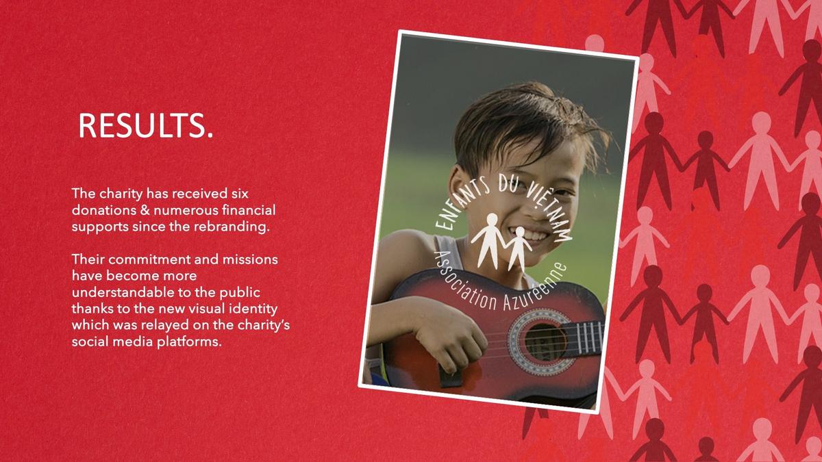
We wanted to portray the lightness of the children, their smiles, and the notion of family that they all share. The goal isn’t to arouse pity, but rather to highlight what the association brings to these children and procure an extremely positive emotion.
As education is not free in Vietnam, AAEDV primarily focuses on providing financial support to parents by sponsoring their children to access education. At AAEDV, our sponsors commit for the long term, and child sponsorship often begins in primary school and continues until after university graduation. Every year, our NGO enables around 40 disadvantaged families from the Mekong region to provide a future for their children by sending them to school.
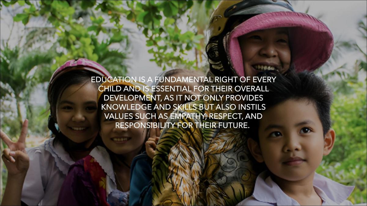
Education is a fundamental right of every child and is essential for their overall development, as it not only provides knowledge and skills but also instils values such as empathy, respect, and responsibility for their future.
CREATIVE EXPRESSION
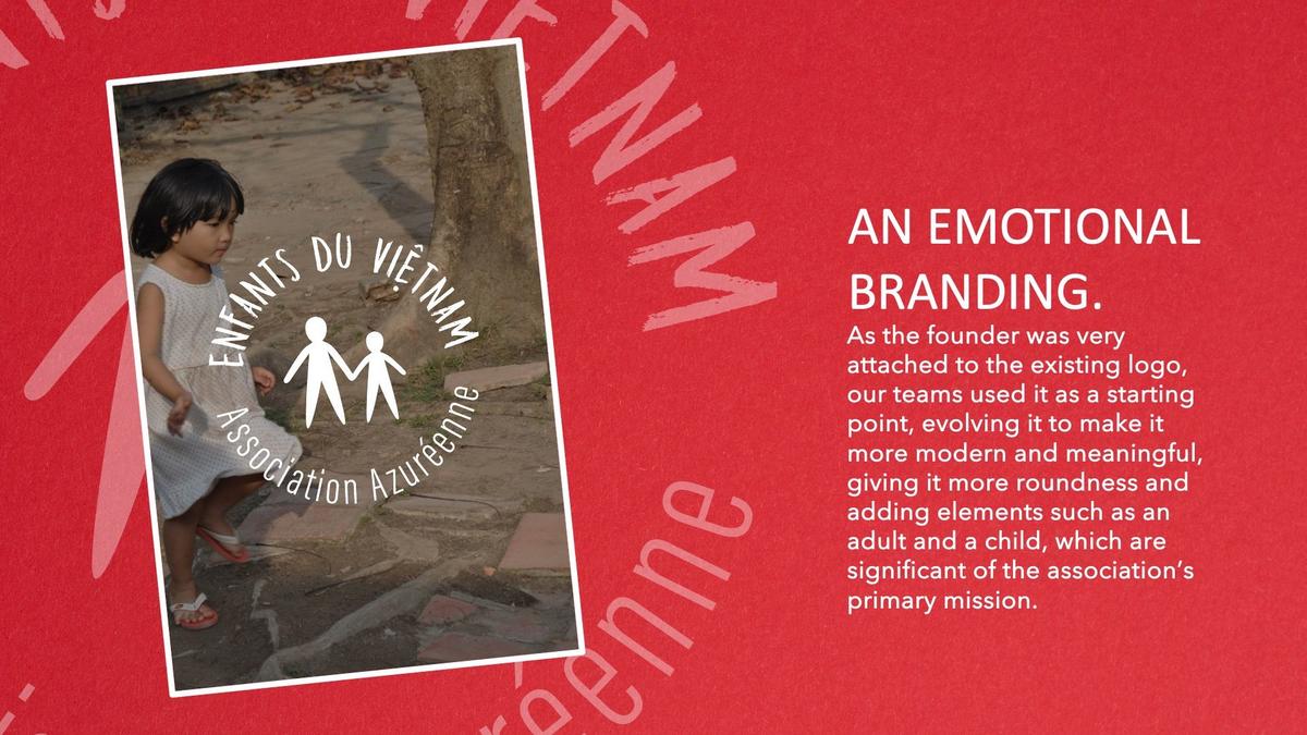
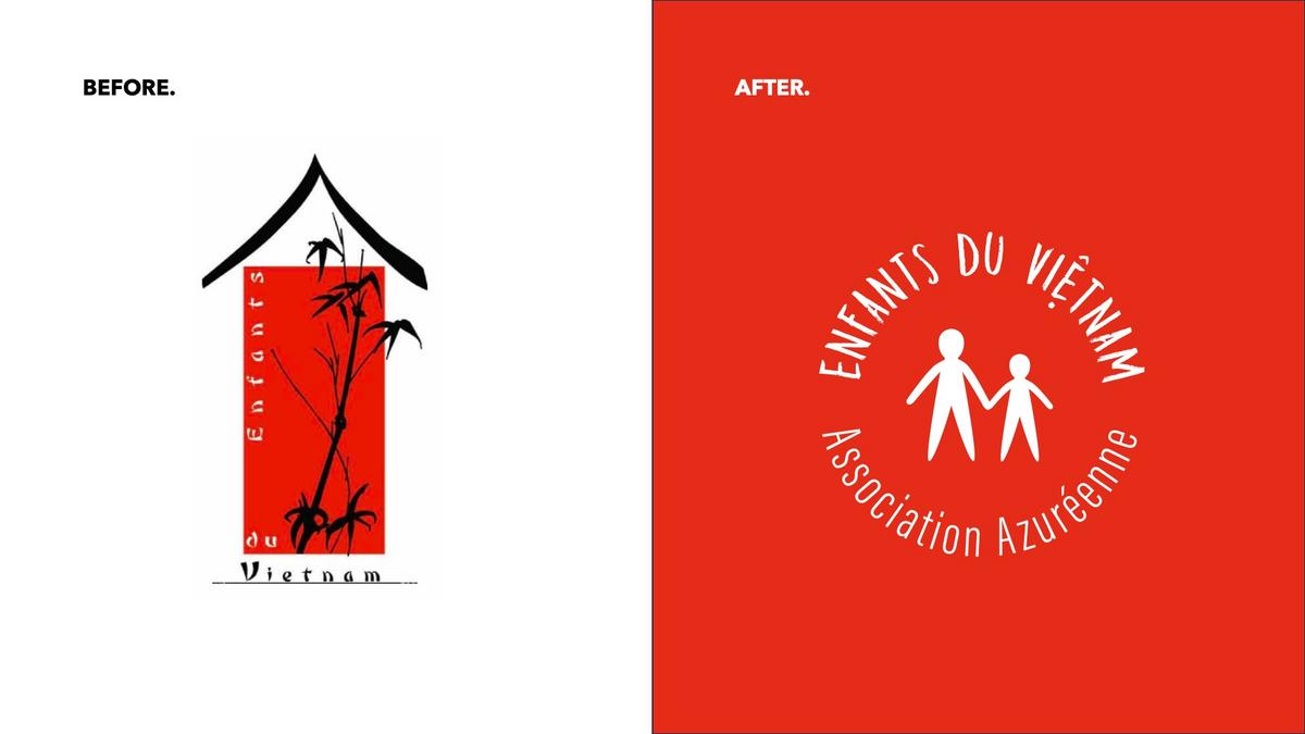
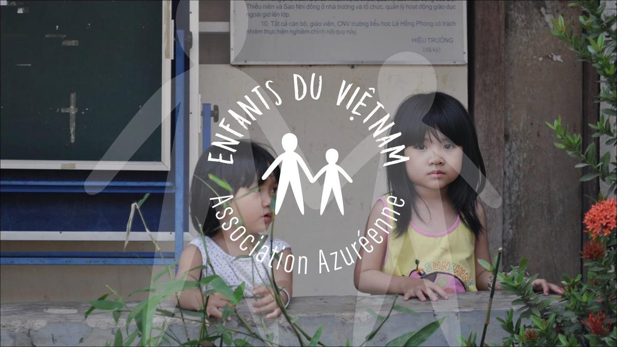
As the founder was very attached to the existing logo, our teams used it as a starting point, evolving it to make it more modern and meaningful, giving it more roundness and adding elements such as an adult and a child, which are significant of the association’s primary mission.
CBA has opted for a lighter, more modern typography, while retaining iconographic features such as the "hat" on the - Vietnamese “E”, which was originally created as a metaphor for the foster home. It is also a nod to the pronunciation of the word in Vietnamese. CBA deliberately chose to keep the red colour of the initial logo as a transition since it is considered in Vietnam as a strong color with a positive connotation.
RESULTS
The charity has received six donations & numerous financial supports since the rebranding.
Their commitment and missions have become more understandable to the public thanks to the new visual identity which was relayed on the charity’s social media platforms.
-------------
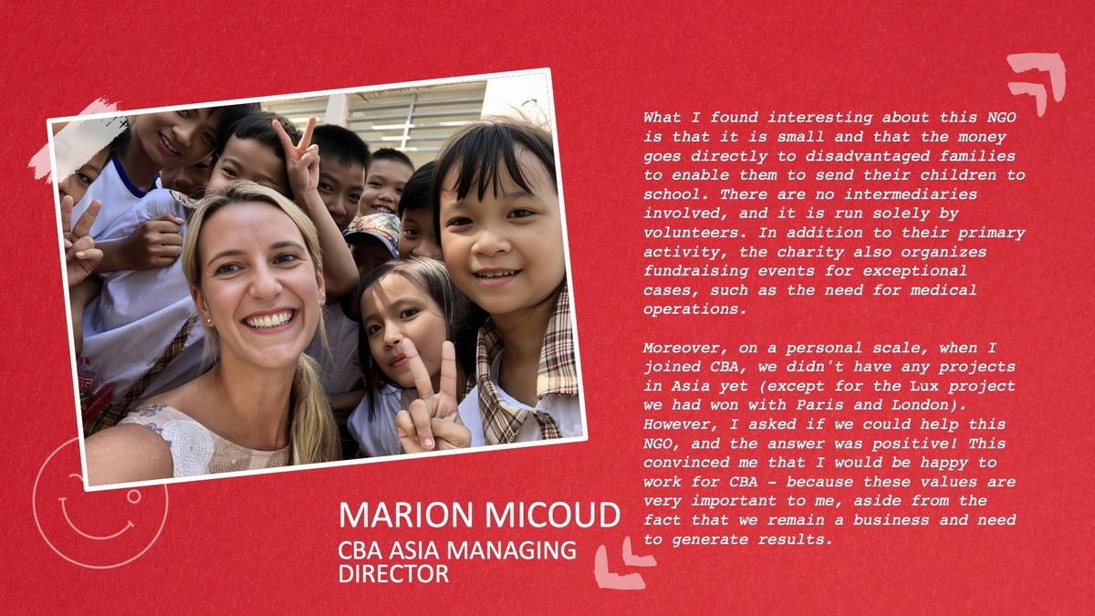
What I found interesting about this NGO is that it is small and that the money goes directly to disadvantaged families to enable them to send their children to school. There are no intermediaries involved, and it is run solely by volunteers. In addition to their primary activity, the charity also organizes fundraising events for exceptional cases, such as the need for medical operations.
Moreover, on a personal scale, when I joined CBA, we didn't have any projects in Asia yet (except for the Lux project we had won with Paris and London). However, I asked if we could help this NGO, and the answer was positive! This convinced me that I would be happy to work for CBA - because these values are very important to me, aside from the fact that we remain a business and need to generate results.
Marion Micoud, Managing Director CBA Asia
